
When starting my designs for this advertising campaign the overall strategy was to immediately separate Brightbloom from the generic eco brands (which prompted the original name change from “eco future.”) This was achieved by delivering two distinct high impact messages.
Intial Advertising plans
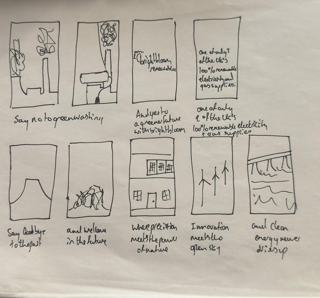
The first message is one of aspiration and innovation with the sequence showing the dramatic demolition of old cooling towers and instantly transitioning to clean sources of energy providing a compelling visual metaphor for the energy revolution. The voiceover of: “precision meets the power of nature” overlaid with the visual of the precise work of the wind turbines; Then “clean energy never runs dry” over a dam reinforces the brands reliability and optimism and directly supporting the following line “helping the future bloom green” which leverages powerful visuals to deliver the hope while mixing in the bright bloom name.
Greenwashing Advert
*The above video is at a lower resolution due to website limits but the full quality version is available below
Full Resolution Greenwashing Advert
The second video is one that helps to reinforce the ideas of transparency and trust. It directly addresses the deep seated skepticism prevalent in the sustainability focussed persona by confronting the fact that greenwashing is taking over. By displaying real industry headlines it is also validating the audience’s awareness. This is crucial to build credibility by acknowledging the industry’s flaws when it comes to saying one thing and doing another but in acknowledging this it also highlights that Brightbloom is an honest alternative therefore satisfying the honesty and ethical practices highlighted in the brand personality.
Power Advert
*The above video is at a lower resolution due to website limits but the full quality version is available below
Speaking as a whole the videos serve as a visual hook for the brand, maintaining strict consistency with the visual identity shared in the app and banner designs. It does so by using the analogous palette, in particular the yellow which is vital as it is used not only for emphasis and brand recognition but it also helps to highlight the final call to action. The brand’s dark green also dominates the final logo screen, anchoring the message in nature and growth and the high contrast ensures legibility of the typeface and reinforces the visual clarity across all touch points. As well as this the slightly informal tone of the greenwashing advert it speaks to them directly as a member of the community therefore aligning with the personas values. The videos are both succinct and end with an unmissable call to action reflecting the brands commitment to efficiency ensuring the viewer is funneled towards the potential interaction.
Overall the videos use design, speed and strategic messaging to create an immediate and memorable impact. They successfully transition the audience from witnessing the problem (greenwashing/Coal plants) to embracing the solution in Brightbloom, effectively setting the stage for the detail oriented, transparent experience offered by the company and the accompanying app.
Leave a Reply