
The Brightbloom mobile app started with an initial design which was translated into two mid fidelity designs that were then picked from to create the final Brightbloom app design.
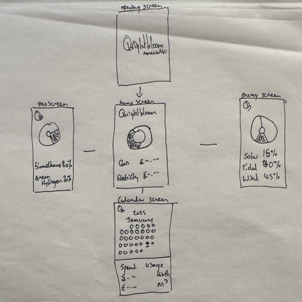
Initial drawn design
The final design is designed to function as an extension of the brand’s ideals of transparency, innovation and optimistic energy as outlined by the identity prism. The company differentiates itself from the crowd as a brand of honesty and reliability and the design reflects this by prioritising the utmost levels of transparency for instance where the renewable energy and gas screens do not just display usage but also show the exact breakdown. The visualisation of such also helps to prove the companies ethical standing and transparency ensuring the user feels a genuine connection to the positive environmental impact highlighted earlier on.
Mid Fidelity Design 1
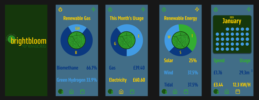
The research identified the key persona as a younger sustainability focused demographic who values clarity and community. It also highlighted the desire for education which is reflected in the overlay screens that explain all the sources and educating them on how their energy is generated thus transforming them from passive customers into informed community members. On top of this the interface moves away from the sterile white of normal utility apps and by using a darker interface with dark green backgrounds the app feels more premium and tech forward while reducing screen glare and this dark mode is a preference often used by the younger tech savvy users.
Mid Fidelity Design 2
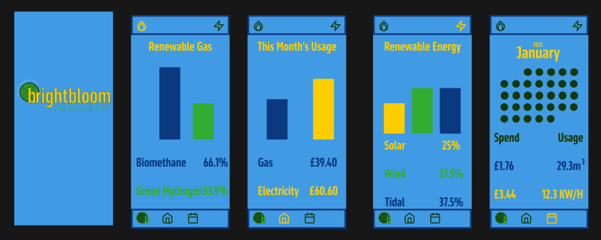
The user interface adheres to the analogous colour palette developed in the branding phase to ensure its legibility and brand recognition. The deep green background anchors the app in nature while the high contrast yellow is strategically used for critical information like pricing and active dates ensuring that the most important data stands out immediately. As well as this the use of the brands sans serif typography ensures that the interface is accessible and easily legible even at small sizes with the contrast between the light text and dark background ensuring users can read their usage data without causing any eye strain. The use of the same colours also reduces the chance of any visual fatigue.
The User experience is reflective of the brand personality traits of efficiency and reliability which can be seen in areas such as the navigation bar which uses familiar models found on phones ensuring people can easily navigate the app with zero learning curve while also changing colour when you are on the page so you know where you are on the app. As well as this the data is clearly visualised in donut charts and clear graphs which turns boring statistics into a visually engaging screen that delivers all the necessary information. This user control is very important with clear options for flexible and fixed plans and choices for two factor authentication providing the user with control and flexibility further reinforcing the brands reliability.
Final Design

Overall the design bridges the gap between Brightbloom’s uplifting visual identity and the functional needs of its potential users by creating a digital environment that is as ethical as it is usable.
Final Design Walkthrough Video
*The above video is at a lower resolution due to website limits but the full quality version is available below
Below is the link to access the whole Figma file
Leave a Reply