This set of additional media helps to show how Brightbloom and its branding could be used in printed format using the CMYK logomarks and company fonts
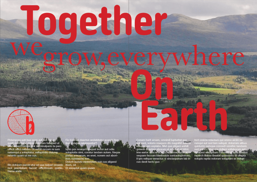
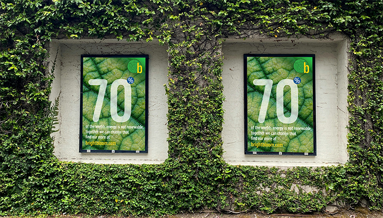
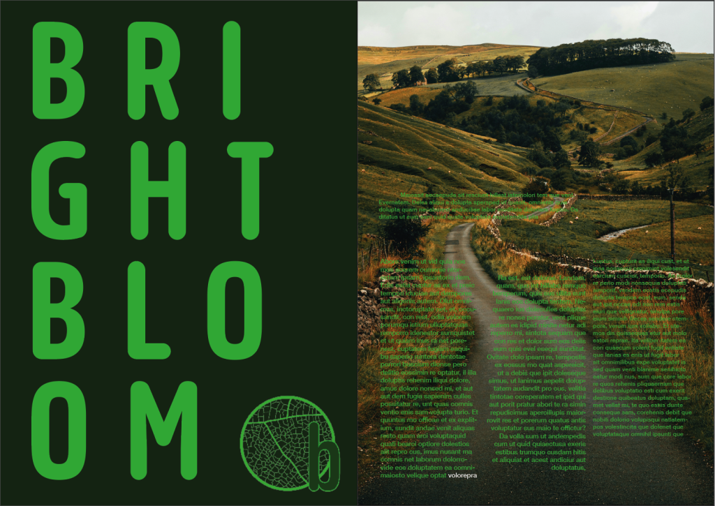

This set of additional media helps to show how Brightbloom and its branding could be used in printed format using the CMYK logomarks and company fonts
When starting my designs for this advertising campaign the overall strategy was to immediately separate Brightbloom from the generic eco brands (which prompted the original name change from “eco future.”) This was achieved by delivering two distinct high impact messages.
Intial Advertising plans
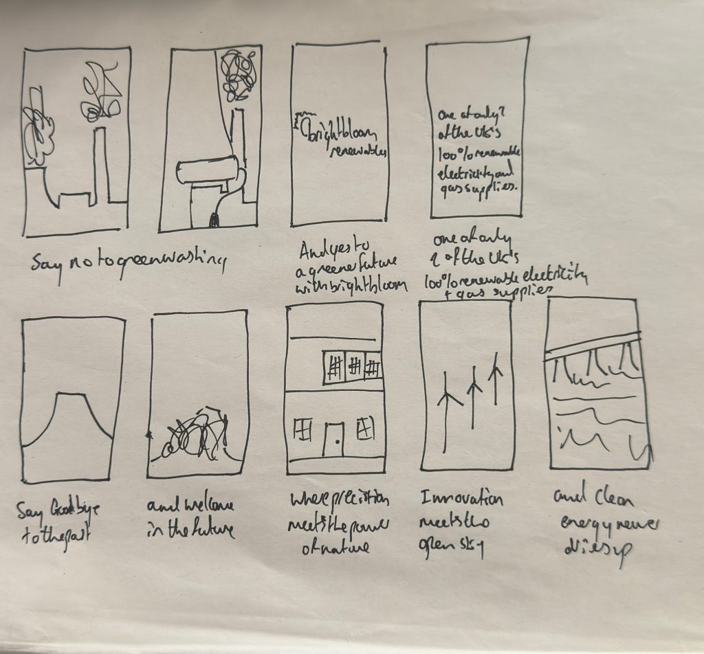
The first message is one of aspiration and innovation with the sequence showing the dramatic demolition of old cooling towers and instantly transitioning to clean sources of energy providing a compelling visual metaphor for the energy revolution. The voiceover of: “precision meets the power of nature” overlaid with the visual of the precise work of the wind turbines; Then “clean energy never runs dry” over a dam reinforces the brands reliability and optimism and directly supporting the following line “helping the future bloom green” which leverages powerful visuals to deliver the hope while mixing in the bright bloom name.
Greenwashing Advert
*The above video is at a lower resolution due to website limits but the full quality version is available below
Full Resolution Greenwashing Advert
The second video is one that helps to reinforce the ideas of transparency and trust. It directly addresses the deep seated skepticism prevalent in the sustainability focussed persona by confronting the fact that greenwashing is taking over. By displaying real industry headlines it is also validating the audience’s awareness. This is crucial to build credibility by acknowledging the industry’s flaws when it comes to saying one thing and doing another but in acknowledging this it also highlights that Brightbloom is an honest alternative therefore satisfying the honesty and ethical practices highlighted in the brand personality.
Power Advert
*The above video is at a lower resolution due to website limits but the full quality version is available below
Speaking as a whole the videos serve as a visual hook for the brand, maintaining strict consistency with the visual identity shared in the app and banner designs. It does so by using the analogous palette, in particular the yellow which is vital as it is used not only for emphasis and brand recognition but it also helps to highlight the final call to action. The brand’s dark green also dominates the final logo screen, anchoring the message in nature and growth and the high contrast ensures legibility of the typeface and reinforces the visual clarity across all touch points. As well as this the slightly informal tone of the greenwashing advert it speaks to them directly as a member of the community therefore aligning with the personas values. The videos are both succinct and end with an unmissable call to action reflecting the brands commitment to efficiency ensuring the viewer is funneled towards the potential interaction.
Overall the videos use design, speed and strategic messaging to create an immediate and memorable impact. They successfully transition the audience from witnessing the problem (greenwashing/Coal plants) to embracing the solution in Brightbloom, effectively setting the stage for the detail oriented, transparent experience offered by the company and the accompanying app.
The designs created for Brightblooms promotional banners were developed to communicate the brand’s identity as an innovative, optimistic and nature driven renewable energy company as well as having each revert to their original format once cycled allowing them to constantly cycle without any awkward jumps.
Each composition applies the core principles of the brand: innovative, environmental responsibility and forward thinking while using the brand colours, brand typography and layout to create clarity and impact across digital advertisements. Across all three visuals the colour palette plays a crucial role. The combination of greens, blues and the brand’s distinctive yellow is all derived from the brand rationale with the greens representing nature and growth, the blues symbolising water and hydroelectric power and the yellow showing optimism and the energy of the sun. These colours form harmonious analogous relationships which allow the compositions to feel unified while still providing enough contrast for hierarchy and legibility, the prominent green backgrounds reinforce the brand environmental focus without overwhelming the message while the yellow elements strategically highlight key information and the Brightbloom branding.
All of the designs use scale and contrast to establish a clear reading path. In this first design the banner relies on large, bold numerical typography to grab attention immediately and function as a visual anchor. This oversized figure creates an instant impact and communicates a sense of urgency before the viewer reads the smaller text. The background imagery of a close up leaf and water droplets also strengthens the connection to nature while also adding depth and visual interest through organic patterns. The translucency effect applied to the typography creates a sense of integration between what is said and the natural environment, further reinforcing the brands message of a harmonious connection between technology and nature.
The 300×50 banner uses a diagonal division to create dynamic movement that echoes the brands tagline “energy that moves with the planet” The diagonal shape adds forward directionality suggesting progress and innovation while also directing the viewers attention to the spinning wind turbine. The placement of the logo in the upper left corner aligns with natural reading patterns and helps to establish immediate brand recognition. The contrast between the deep green brand space and the warm toned landscape also helps the banner to feel grounded in nature but also aspirational.
The 300×250 banner with the messaging “turning water into a world of possibilities” is supported by the backing of waves subtly referencing the text without overwhelming it. The website URL is also set in the brand’s bright yellow ensuring it stands out as the call to actions and remains legible across the dark background. The consistency in the logo placement also creates cohesion across the set of banners ensuring the brand recognition regardless of size or format.
Altogether these banners demonstrate an approach that balances aesthetic appeal with clear communication. They rely on visual relationships between colour, scale, typography and imagery to reinforce the brand’s key values of optimism, environmental responsibility and innovative energy solutions. By integrating earlier strategic decisions such as the analogous colour palette and sans serif font, the designs are able to form a cohesive and memorable visual identity that supports the brand’s online presence and its mission to inspire environmental change.
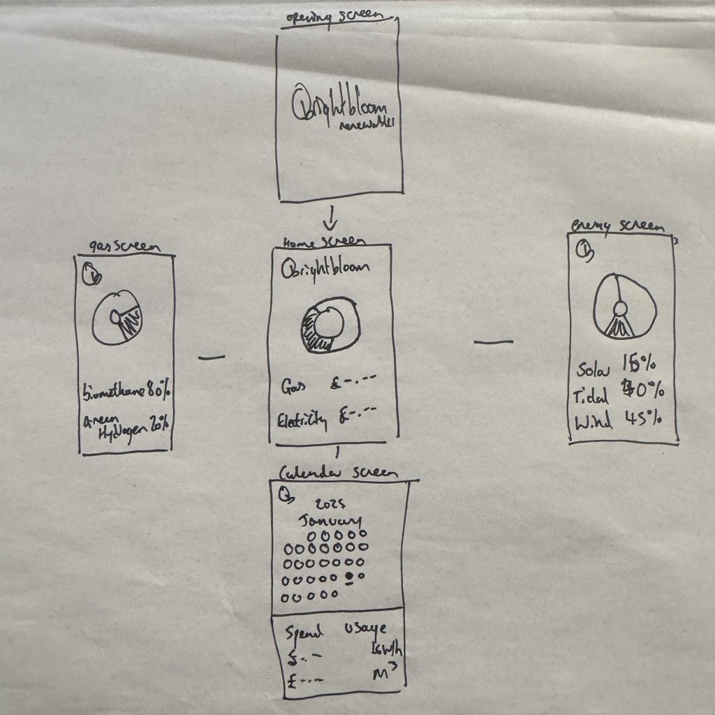
The Brightbloom mobile app started with an initial design which was translated into two mid fidelity designs that were then picked from to create the final Brightbloom app design.
Initial drawn design
The final design is designed to function as an extension of the brand’s ideals of transparency, innovation and optimistic energy as outlined by the identity prism. The company differentiates itself from the crowd as a brand of honesty and reliability and the design reflects this by prioritising the utmost levels of transparency for instance where the renewable energy and gas screens do not just display usage but also show the exact breakdown. The visualisation of such also helps to prove the companies ethical standing and transparency ensuring the user feels a genuine connection to the positive environmental impact highlighted earlier on.
Mid Fidelity Design 1
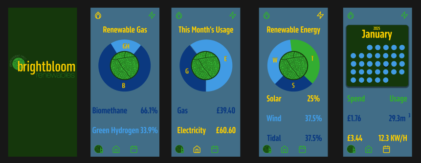
The research identified the key persona as a younger sustainability focused demographic who values clarity and community. It also highlighted the desire for education which is reflected in the overlay screens that explain all the sources and educating them on how their energy is generated thus transforming them from passive customers into informed community members. On top of this the interface moves away from the sterile white of normal utility apps and by using a darker interface with dark green backgrounds the app feels more premium and tech forward while reducing screen glare and this dark mode is a preference often used by the younger tech savvy users.
Mid Fidelity Design 2
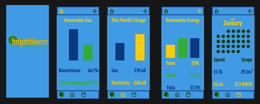
The user interface adheres to the analogous colour palette developed in the branding phase to ensure its legibility and brand recognition. The deep green background anchors the app in nature while the high contrast yellow is strategically used for critical information like pricing and active dates ensuring that the most important data stands out immediately. As well as this the use of the brands sans serif typography ensures that the interface is accessible and easily legible even at small sizes with the contrast between the light text and dark background ensuring users can read their usage data without causing any eye strain. The use of the same colours also reduces the chance of any visual fatigue.
The User experience is reflective of the brand personality traits of efficiency and reliability which can be seen in areas such as the navigation bar which uses familiar models found on phones ensuring people can easily navigate the app with zero learning curve while also changing colour when you are on the page so you know where you are on the app. As well as this the data is clearly visualised in donut charts and clear graphs which turns boring statistics into a visually engaging screen that delivers all the necessary information. This user control is very important with clear options for flexible and fixed plans and choices for two factor authentication providing the user with control and flexibility further reinforcing the brands reliability.
Final Design

Overall the design bridges the gap between Brightbloom’s uplifting visual identity and the functional needs of its potential users by creating a digital environment that is as ethical as it is usable.
Final Design Walkthrough Video
*The above video is at a lower resolution due to website limits but the full quality version is available below
Below is the link to access the whole Figma file

I started with four sketched concepts, each exploring a different interpretation of the company’s values. After developing these into more refined drawings I decided to remove the turbine design from consideration because, although it referenced renewable energy, it lacked in clarity and risked appearing random and overly abstract. This decision helped me to focus on the designs that could communicate the brand more effectively and remain versatile across a multitude of uses.

From there I took my strongest design and worked with my colour I then concentrated on the design I believed to be the strongest, testing it with a range of colour variations of the final colour palette. This experimentation allowed me to see how different shades interacted and which combinations created the most impact and which lacked clarity. Through this process, I discovered that the yellow on green created a strong visual contrast and that layering light upon dark versions of each colour enhanced depth while preserving simplicity. These insights were essential in ensuring the final logo would not only be clear but also recognisable and functional at all scales.

CMYK – 300DPI

RGB – 72DPI

The final chosen logo successfully promotes the company’s identity because it is able to visually embody what Brightbloom stands for; The green communicates nature, growth and eco-consciousness, while the yellow conveys optimism, awareness and visionary energy. These associations align directly with the company’s mission, making the logo both meaningful and emotionally engaging.
When it comes to style, the design balances uniqueness with professionalism. It avoids design cliches like arrows (which are visually linked with recycling symbols) and overly literal imagery like flowers, both of which risk diluting the individuality of the brand. Instead, the final design is clean, modern and distinctive. Qualities that make it more memorable and well suited to a company positioning itself as innovative and future focussed.
Functionally, the logo is clear and effective across a wide range of concepts and remains legible in small sizes. It also works well in CMYK, RGB and even monochrome formats when colour is restricted. This adaptable nature of the design allows the logo to operate as a reliable visual anchor for the brand across digital platforms as well as printed articles.
These are all important as the logo operates as the core element of the brand’s visual identity, establishing an immediate connection to renewable energy, sustainability and positive environmental impact. Its refined structure and balanced palette support a cohesive online presence allowing Brightbloom to present itself consistently across any websites and social media. The modern, fresh look also reinforces the company’s message of visionary, innovative solutions within the renewable energy sector.

To support the primary logo, I also developed a series of wordmark logos with different colour variations formed from the final colour palette, as well as black and white versions for use in more restricted scenarios. These ensure maximum flexibility and consistency, enabling the brand to maintain a strong identity in any potential setting or medium.
Brand Kit

This brand kit helps to show my brands full letter mark along with its standalone fonts and colours in a way to help illustrate how it could potentially be used and placed in a website setting on differing backgrounds. As well as showing the full letter mark it also shows other iterations that omit certain parts for the sake of clarity while still maintaining clear brand identity.
Research Moodboards

The three smaller mood boards above and their accompanying research help to outline the key visual themes shared across similar brands in each field. Understanding these common elements help to identify where the chosen company can align with existing expectations and where it can deviate intentionally to stand out from the crowd. This balance ensures the brand fits naturally within the chosen sector while still gaining a competitive edge through distinct visual choices.

The mood board combines imagery of renewable energy with themes such as trust, community and transparency all of which have been highlighted as essential to the brand’s online presence. It also highlights potential colours, patterns and motifs that can inspire design work, this ensures that the final visuals feel relevant to industry as well as compelling to consumers.

The user persona outlines the typical consumer for an eco-energy brand. Someone younger, sustainability focused and drawn to transparent companies with community oriented values. This insight helps to ensure that the brand visual style, tone and digital touch points resonate with audiences who prioritise this clarity, accessibility and ethical practice.

The identity prism provides a view of the brand from six perspectives. Reinforcing its commitment to responsibility, transparency and modern renewable energy solutions. This framework supports a coherent online identity where every visual and verbal element communicates reliability, innovation and a clear purpose.

The personality dimensions translate the brand into human characteristics, emphasising the need for honesty, innovation, reliability and efficiency. These traits guide the tone and visual expression of the brands online identity, ensuring that the digital presence of the brand feels both trustworthy as well as forward thinking. The emphasis on excitement helps introduce a modern and dynamic edge that keeps the brand from feeling too generic or overly serious.

The brand matrix helps to illustrate what the brand would resemble if it were represented through objects, materials and lifestyle elements. Its emphasis on greenery and low impact, long lasting items supports an online presence that would feel natural, sustainable and rooted in environmental responsibility; qualities that strengthen both the credibility and appeal of the brand.
Rebrand

This graphic presents the new name Brightbloom and the key reasons for replacing Eco Future. While accurate, Eco Future blends into a very overcrowded field of “eco” brands, making it difficult for the company to stand out. Brightbloom however offers a more distinctive, uplifting and memorable identity, It conveys growth, optimism and positive change, qualities which align directly with the company’s mission in renewable energy. The new name is more imaginative, easier to recall and better positioned to differentiate the brand from others in such a competitive market.
Colour Schemes

I explored four initial colour palette options and refined them further to reach the final colour scheme. The early palettes felt dull and lacking in vibrancy, due to this I introduced some brighter tones and a striking yellow to create more visual energy. The colours still didn’t entirely work well together so I proceeded to adjust them one by one reducing the turquoise nature of the brighter green and changing the darker green to a more natural tone as well as making both blues that shade brighter which resulted in a far more cohesive palette.

The final colour scheme consists of analogous colours that promote unity, calm and visual balance. Each shade is rooted in the natural environment which directly supports the company’s focus on renewable energy. The yellow symbolises the sun and solar power, the blues represent both the sea and hydroelectric energy and the greens convey plant life and wind power. This palette not only strengthens the concept of the brand but also will ensure visual consistency across digital and printed applications.